
The EVENENT Website Redesign, Compared Before and After
A logo-led content collection became a content-studio website that explains the company, its process, and its proof.
From a content collection to a website that explains the studio and proves its work
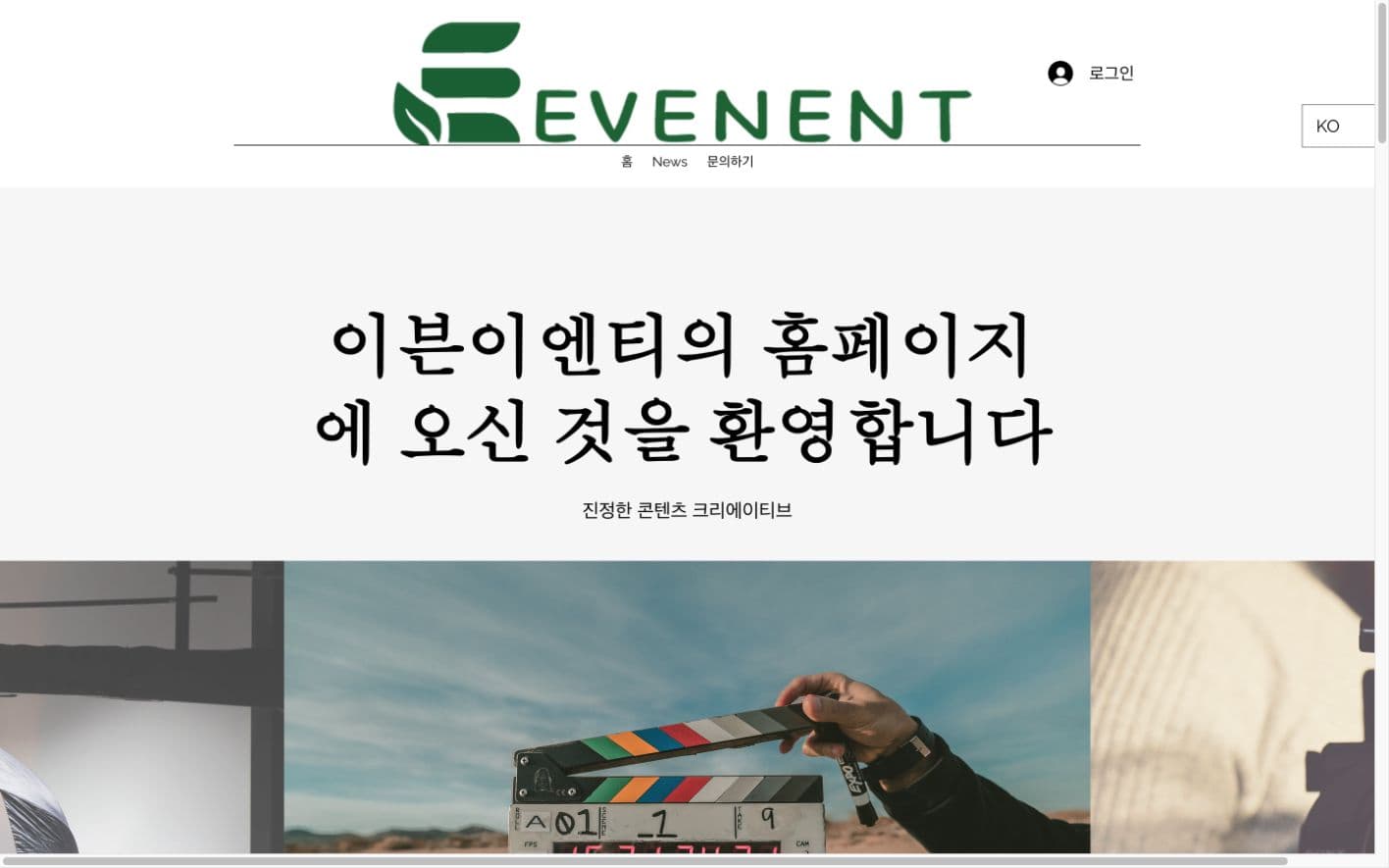
An oversized logo and welcome message led into original IP, a video widget, blog posts, and generic service copy. The material existed, but the company's scope and completed projects were difficult to understand as one story, and the fixed-width layout broke on mobile.
The redesign states the studio's role and selected work immediately, then moves through capabilities, production stages, projects, IP, video, News, and contact. Existing material was reorganized around proof and rebuilt as a responsive multilingual experience.
On August 2, 2026, we first preserved the before state from the live evenent.com. We then ran the redesign locally and captured it under matching conditions. The after screen had not yet replaced the production site at the time of capture, so this is a record of the two states before launch, not a claim that the redesign was already live.
The First Five Seconds Changed
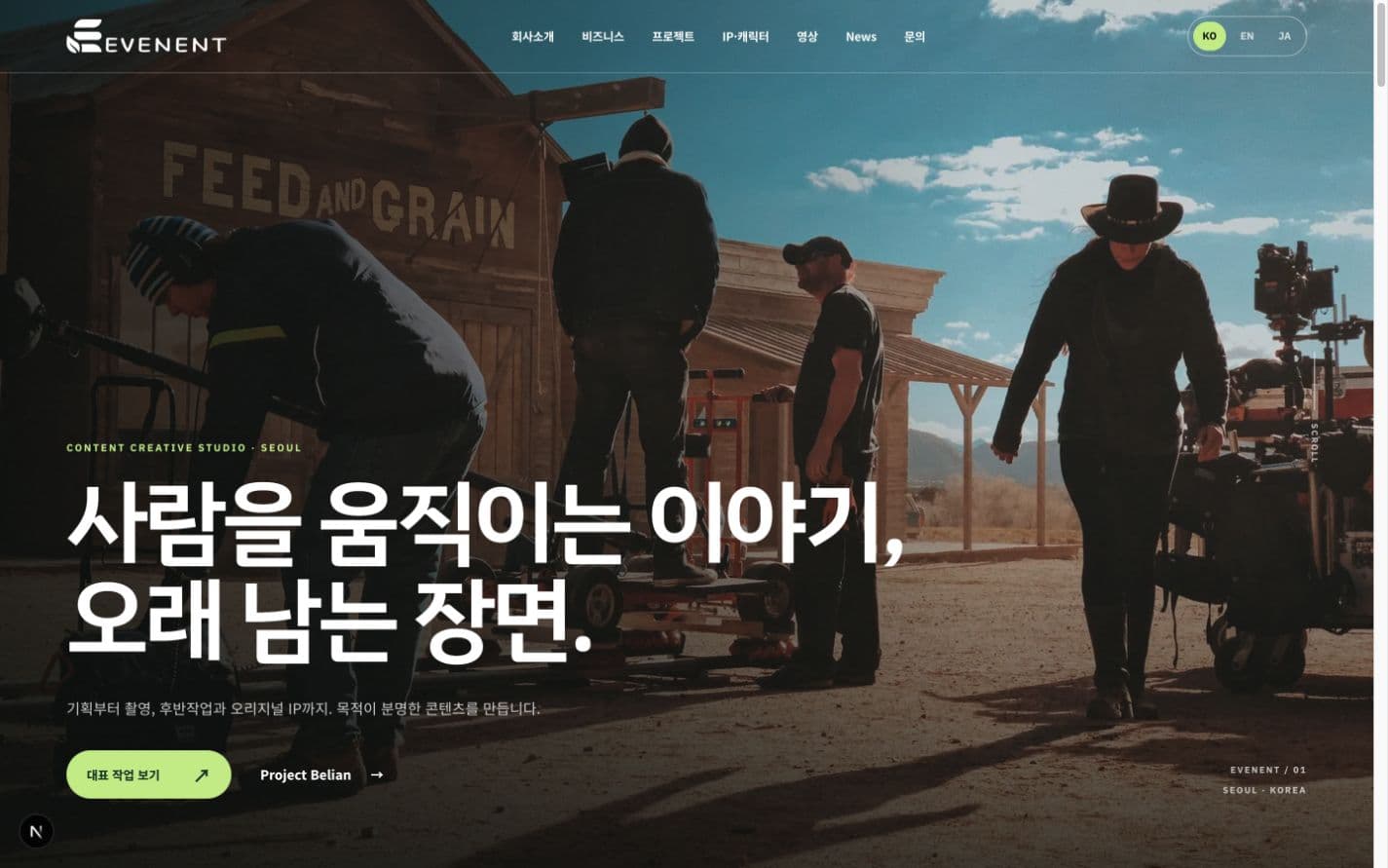
Both screens were captured on August 2, 2026 with a 1440×900 browser viewport.
The old headline welcomed people to the EVENENT website but did not explain what the company made. A changing set of production images still left a new visitor to decide whether EVENENT was a film crew, content distributor, or IP company.
The redesign opens with a promise — stories that move people and scenes that stay — then names strategy, filming, post-production, and original IP. Selected Work and Project Belian give the visitor two immediate next steps. The hero changed from a greeting into positioning and navigation.
We Removed the First-Visit Blocker
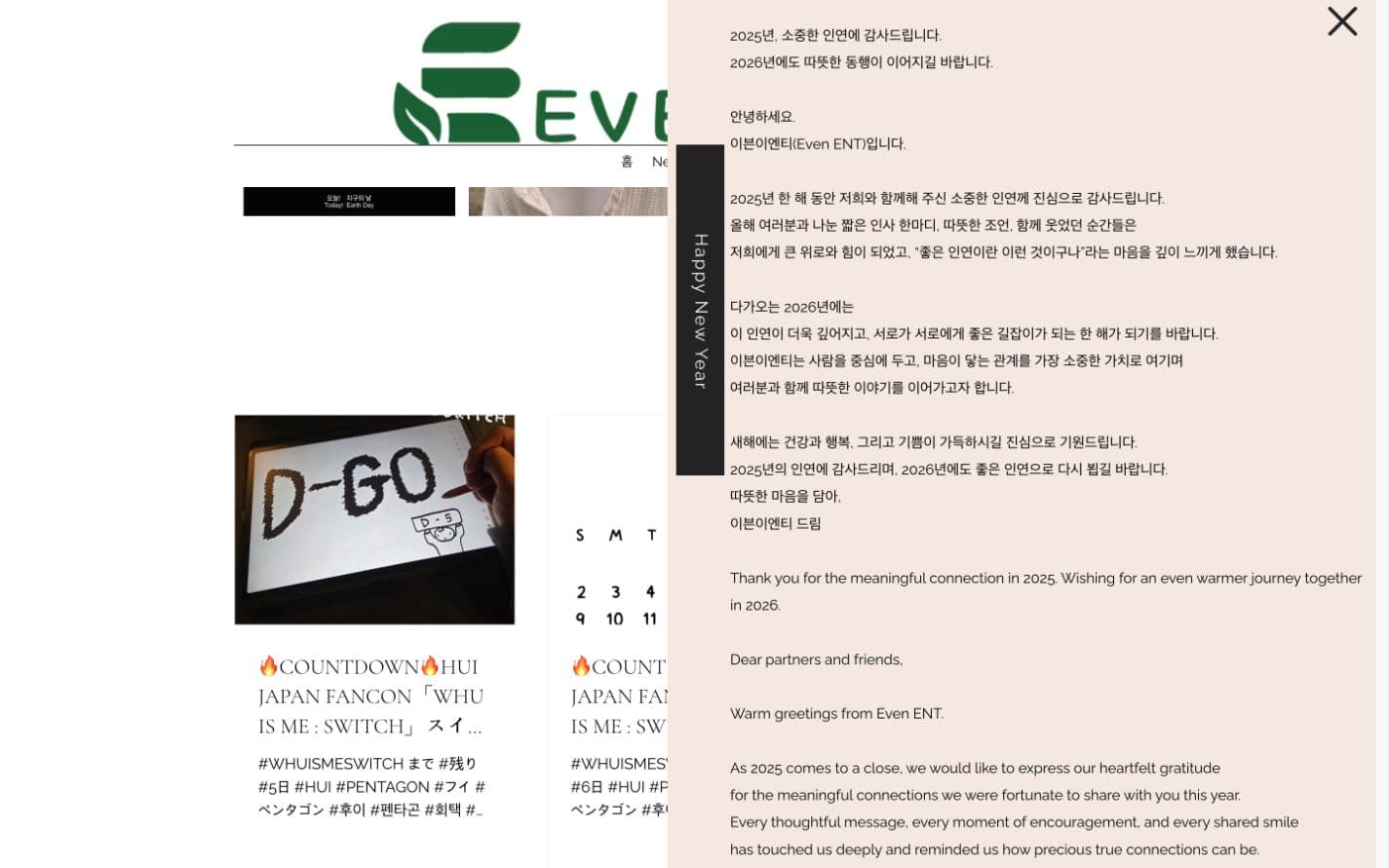
The live site still opened a long year-end message from 2025 in August 2026. On desktop it covered more than half of the page. The redesign removes the blocking popup: timely updates belong in News, while the homepage remains focused on understanding the company and its work.
Services Became a Production Process
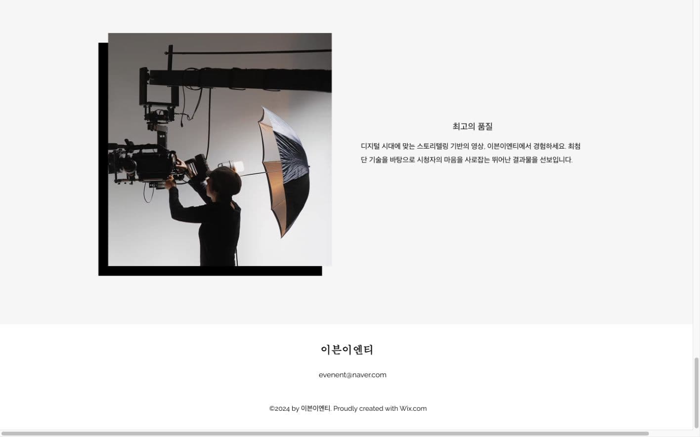
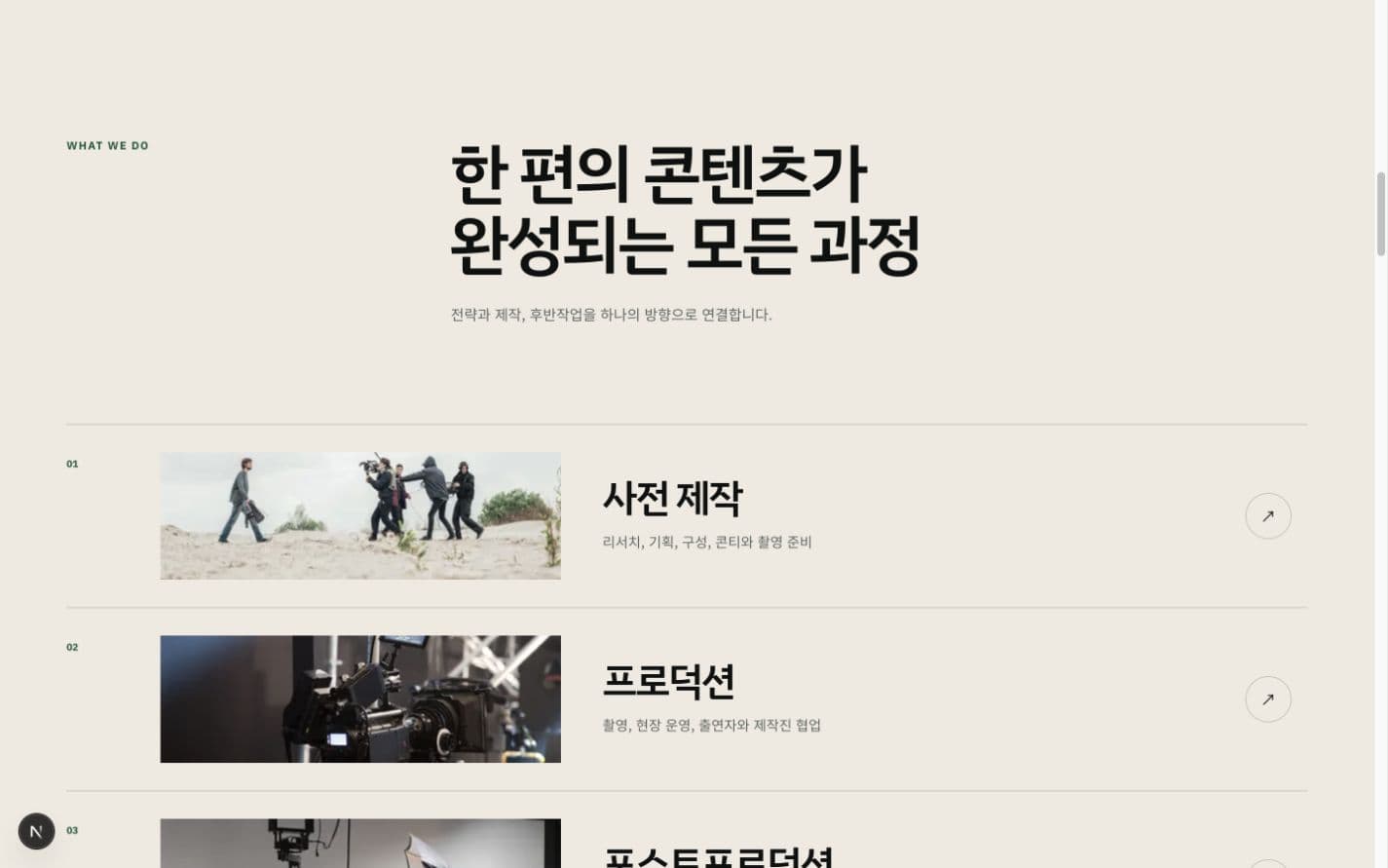
An abstract quality claim became a process a potential client can understand and scope.
The old section used phrases such as ‘best quality’ and ‘cutting-edge technology,’ but it did not show what a client could commission. The redesign separates pre-production, production, and post-production, then names research, storyboards, filming, on-site operations, editing, color, sound, and delivery. Every row links to the relevant business detail.
A Content Feed Became Project Proof
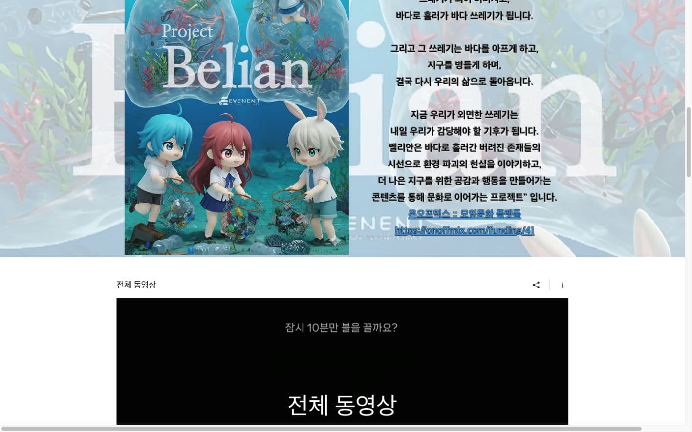
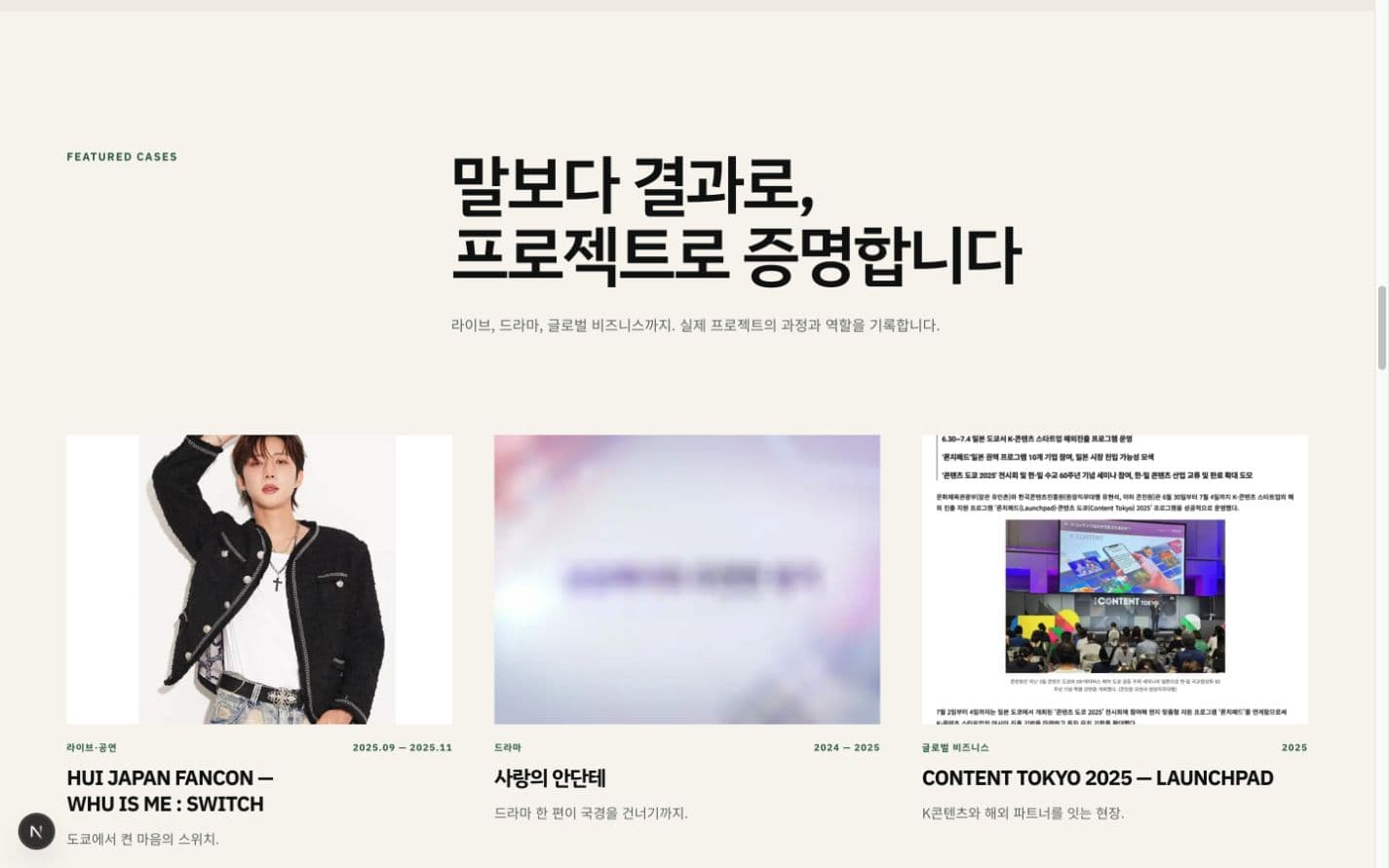
The redesign moves from listing owned content to proving completed work.
The old one-page flow placed Project Belian, an external funding URL, a Wix video widget, and long Japanese blog headlines one after another. The pieces existed, but visitors had to assemble the company's capabilities themselves.
The redesign now moves through positioning, capabilities, production stages, featured cases, original IP, selected videos, News, and contact. Featured cases identify the project type and period and lead to full project pages. The HUI Japan fancon, Love Andante, and CONTENT TOKYO now prove the claim before another marketing sentence has to.
Mobile Became Its Own Layout
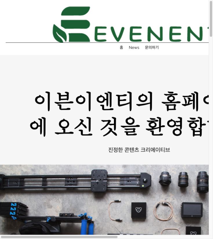
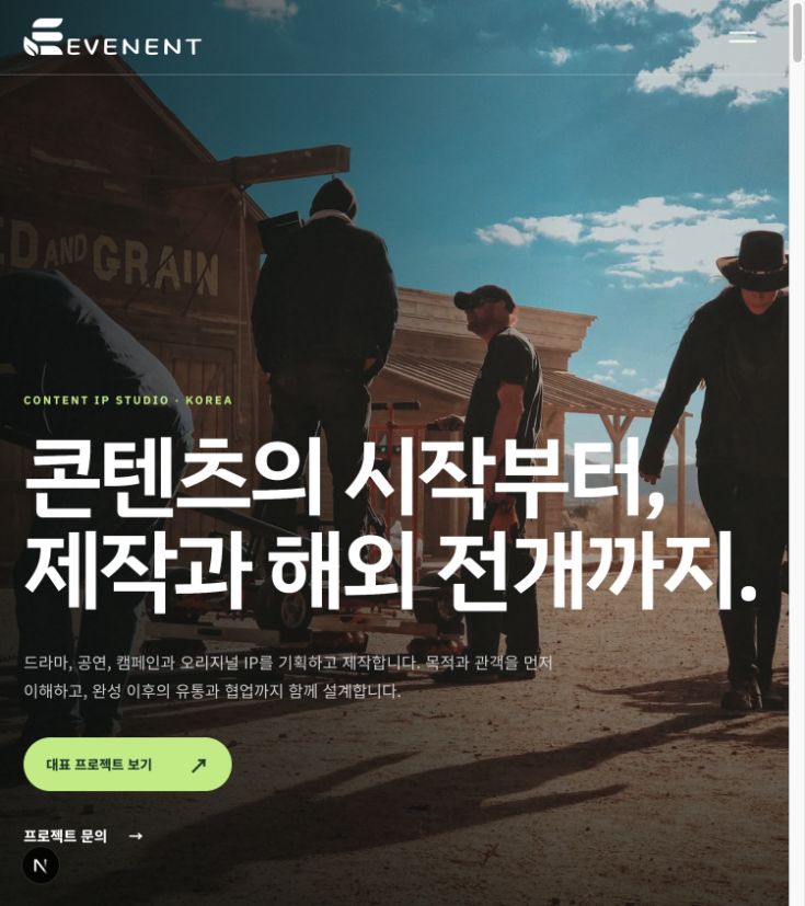
Both were captured with a 750×844 browser viewport. The resulting content area is the same 735×827 pixels, displayed at no more than 360 pixels wide to retain 2× pixel density.
The original mobile screen kept a fixed desktop width, clipping the logo, headline, and images and creating horizontal scroll. The redesign collapses navigation into a menu, resets headline size and line breaks, and keeps the primary action within the first screen. Understanding the company no longer depends on a desktop viewport.
What Changed in Planning
- A welcome message became a statement of role and value.
- Three generic links became task-based navigation across company, business, projects, IP, videos, News, and contact.
- A continuous content feed became a deliberate sequence from understanding to proof to inquiry.
- Generic quality claims became project names, types, periods, and detailed records.
- External widgets and links became contextual pages inside the company site.
What Improved Visually
- A full-screen production still establishes the studio's world in the opening scene.
- Paper, ink, forest green, and lime repeat as one recognizable visual system.
- Large headings, short support copy, actions, and imagery create a consistent reading order.
- Numbers, fine rules, and generous spacing keep dense information easy to separate.
- Logo, navigation, type, cards, and buttons all reflow for the mobile viewport.
The Real Redesign Was the Order of Information
The largest change is not a color or photograph. It is the order in which a visitor can answer four questions: What kind of company is this? What can I commission? What has it actually done? How do I start a conversation? The visual system is there to make that sequence faster to read.
A redesign did not require discarding all existing material. EVENENT's production stills, Project Belian, video archive, and News remained. We reclassified them and changed where each one appears so that every asset helps explain or prove the company.
FAQ
Were the before and after screens captured under matching conditions?
Yes. Desktop used a 1440×900 browser viewport and mobile used 390×844. Both mobile screenshots also have the same 375×812-pixel content area.
Was the redesign already live on evenent.com when captured?
No. On August 2, 2026, the before screen came from the live evenent.com, while the after screen came from the locally running redesign build.
What was the first planning change?
We replaced the welcome message with a clear studio role, then reordered the homepage around capabilities, production stages, project proof, and inquiry.
Was all existing content replaced?
No. Existing production imagery, Project Belian, videos, and News were reused. Their classification, priority, explanation, and links were redesigned.
What changed on mobile?
The fixed-width overflow was removed, and navigation, type, imagery, actions, and cards were reflowed for the mobile viewport.
Continue with a consultation or another website project
Start with your current website
We review the current URL first and separate full-redesign needs from focused improvements.
확인하기 →CGDC 2025 official website
A conference website built around event context, speakers, the timetable, and registration.
확인하기 →Event website development
Review the scope from public information pages to registration and operator tools.
확인하기 →