
From a content collection to a website that explains the studio and proves its work
An oversized logo and welcome message led into original IP, a video widget, blog posts, and generic service copy. The material existed, but the company's scope and completed projects were difficult to understand as one story, and the fixed-width layout broke on mobile.
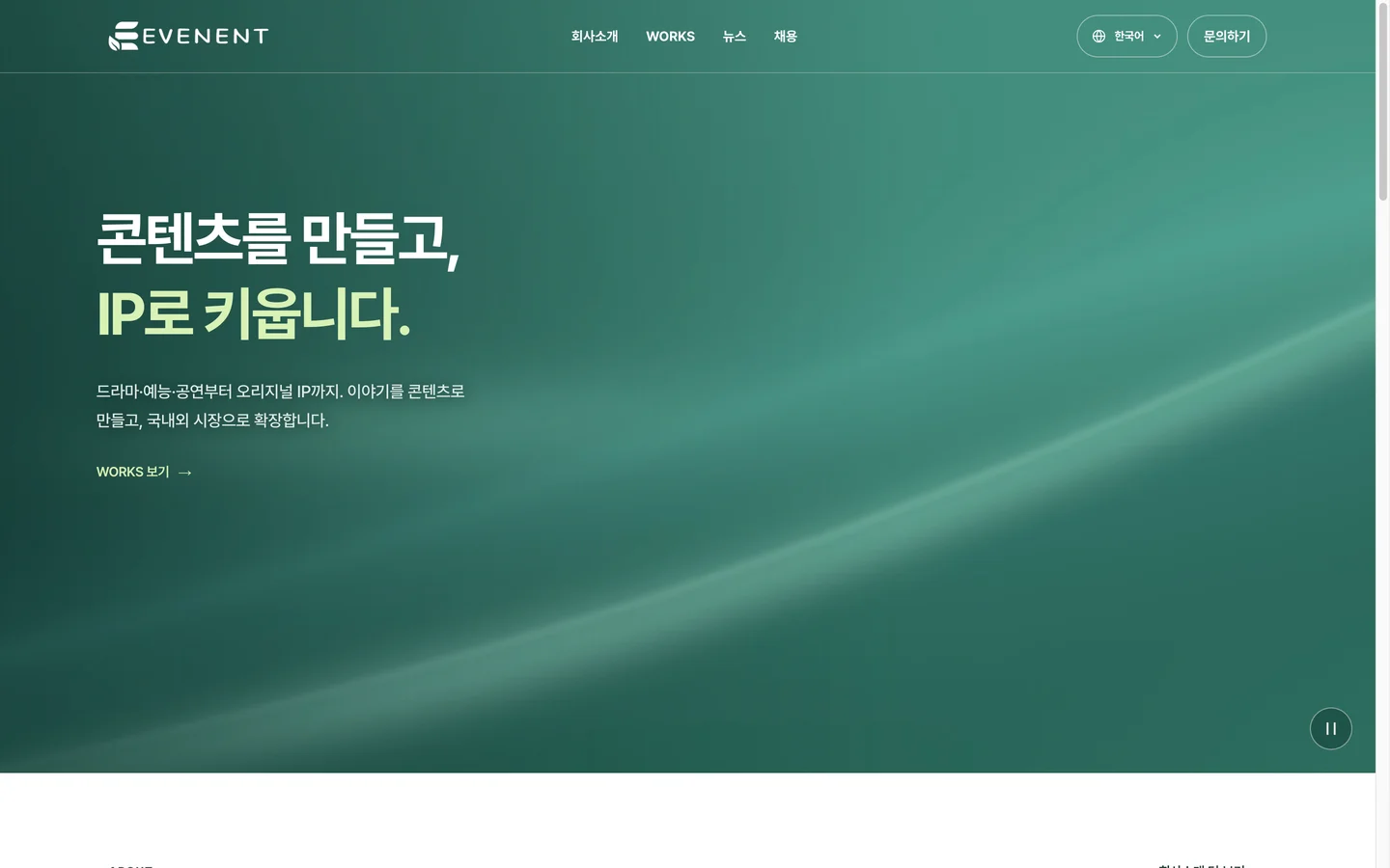
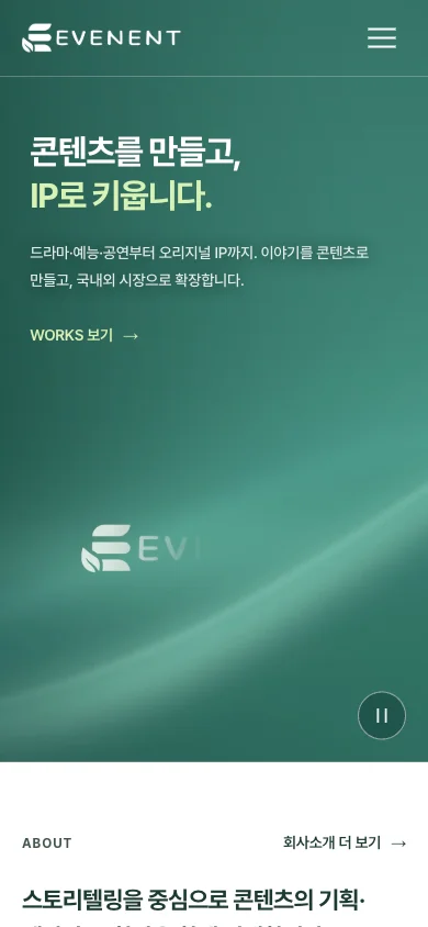
The live site opens with ‘We create content. We grow it into IP,’ followed by ABOUT, the Planning–Production–Distribution–IP Expansion flow, Works, and News. Company, WORKS, News, Careers, Contact, and the English locale are linked through a responsive desktop and mobile structure.
We redesigned the EVENENT website to show both its content production capabilities and IP business. The first redesign organized the company introduction and selected projects. The August public Preview brought original IP forward in response to client feedback. The September site connects planning, production, distribution, and IP expansion with the company's work and news.
September 2026: Connecting Content and IP on One Website
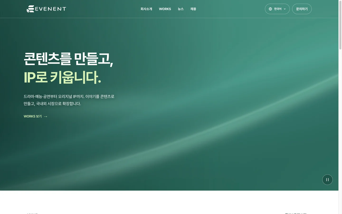
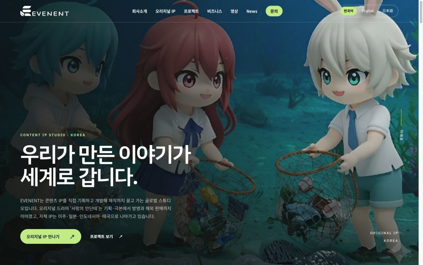
The current hero says, ‘We create content. We grow it into IP.’ It pairs that message with a description spanning drama, variety shows, live events, original IP, and markets in Korea and beyond, plus a direct route to WORKS. Compared with the August Preview's single-IP-led hero, the live version explains both what EVENENT makes and how it expands that work.
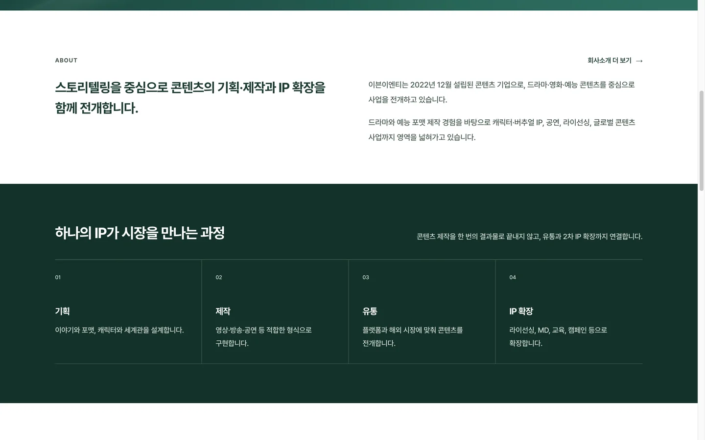
ABOUT follows the hero with a concise account of when the company was founded, its storytelling-led planning and production work, and the areas into which it is expanding. The company origin and present business range can be read in one sequence.
The current structure no longer stops at a production process or leads only with owned IP. It connects planning stories, formats, characters, and worlds; producing them in suitable formats; distributing them through platforms and international markets; and expanding them into licensing, merchandise, education, and campaigns.
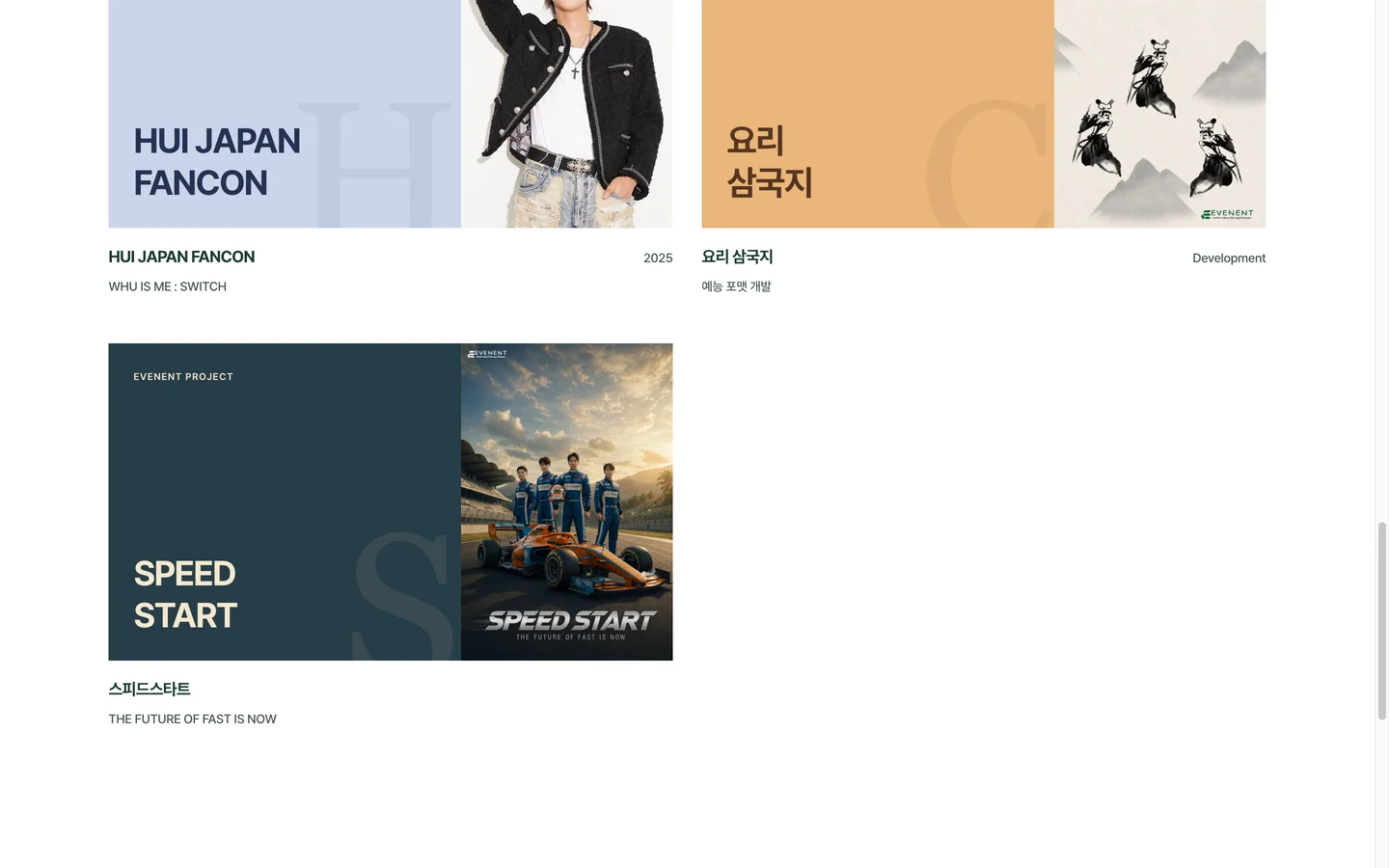
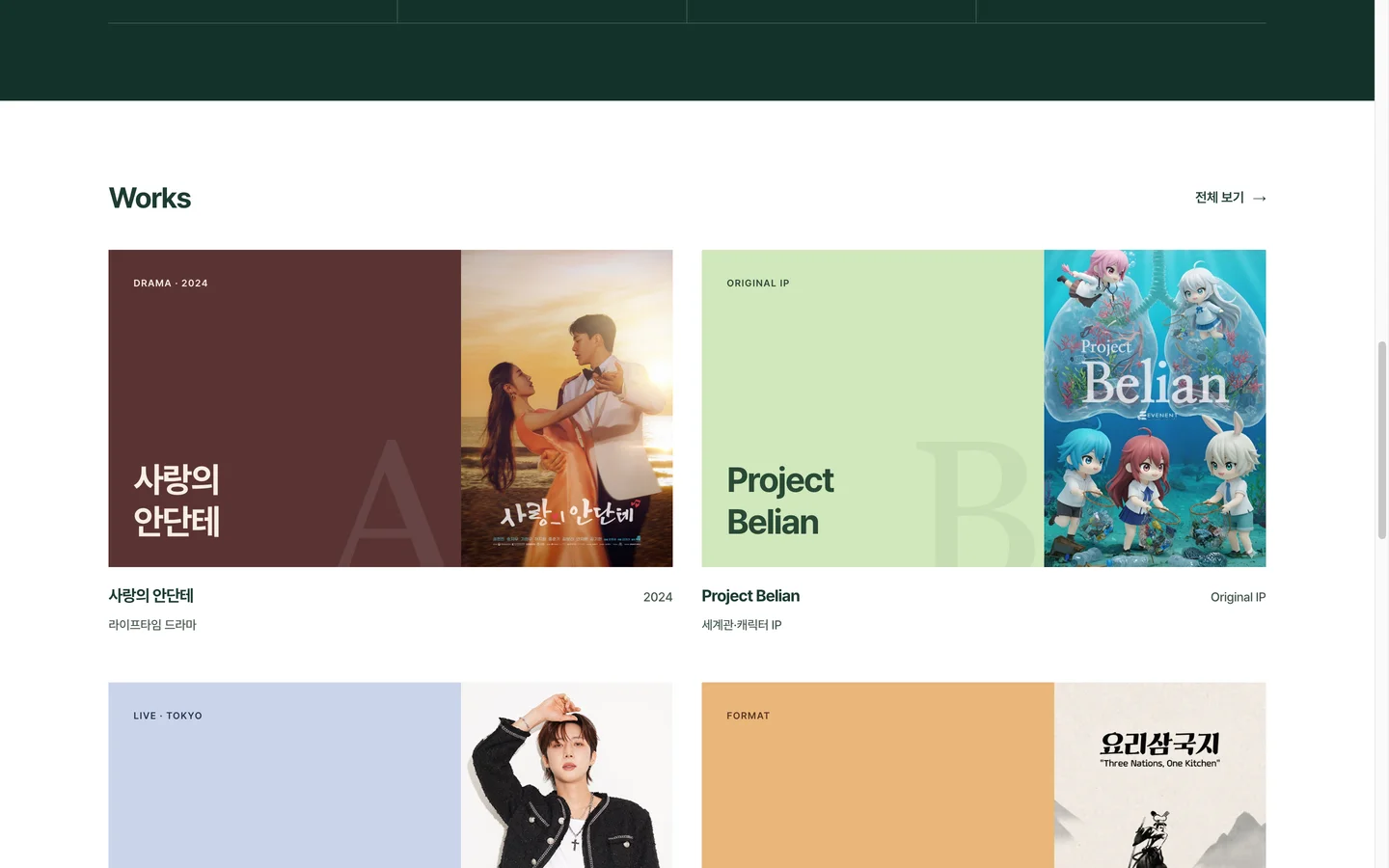
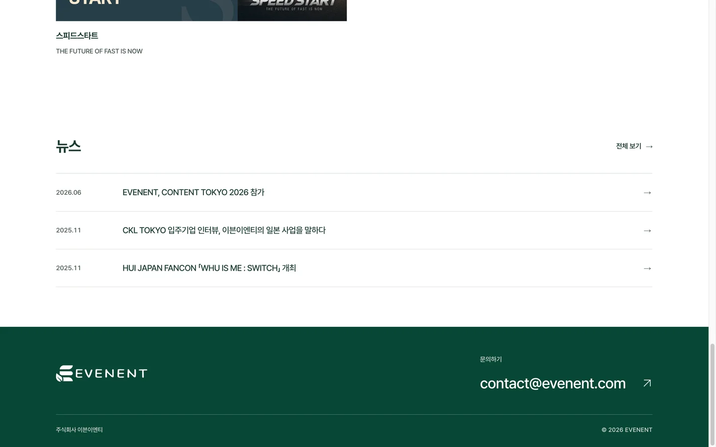
Works places drama, original IP, live events, a format, and an EVENENT project in one comparable set. Each card leads into the separate WORKS page, keeping the homepage summary distinct from the fuller record.
The main menu separates Company, WORKS, News, Careers, and Contact so visitors can find information for their needs. The header language menu also links to the English site.
The August Public Preview Was an Intermediate Stage
The first redesign removed the welcome message and made production scope and project proof explicit. But leading with an end-to-end production statement and a production-set image still made EVENENT look more like a production vendor than a studio whose strength is planning and developing content IP.
The August refinement opened with a promise that the stories created here would go out into the world and replaced the production image with Project Belian. That made the IP-first direction explicit. The live site later broadened the same direction into a connected story of planning, production, distribution, and IP expansion.
The August Preview Put IP Assets Before the Production Process
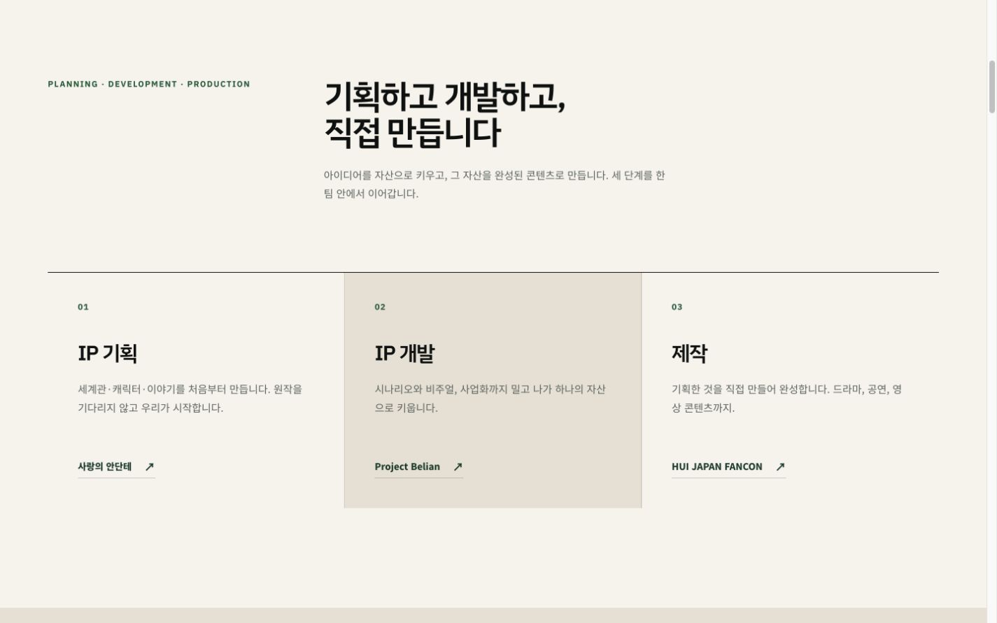
The old three-stage production process helped a buyer scope work, but it made the process more memorable than the company's difference. The August screen grouped the business into IP planning, IP development, and production, then linked each claim to Love's Andante, Project Belian, or HUI JAPAN FANCON.
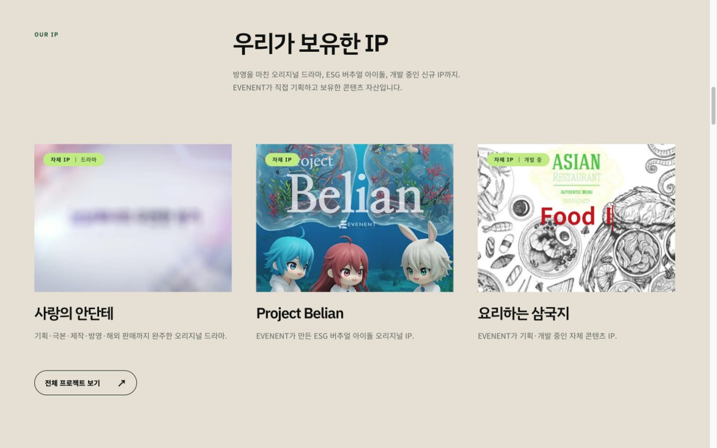
That intermediate stage placed an Owned IP section near the top and distinguished each content asset by status. The production site now presents those assets by type in Works and first explains the four stages through which IP reaches its audience.
The August Preview Placed Project Records Before Contact
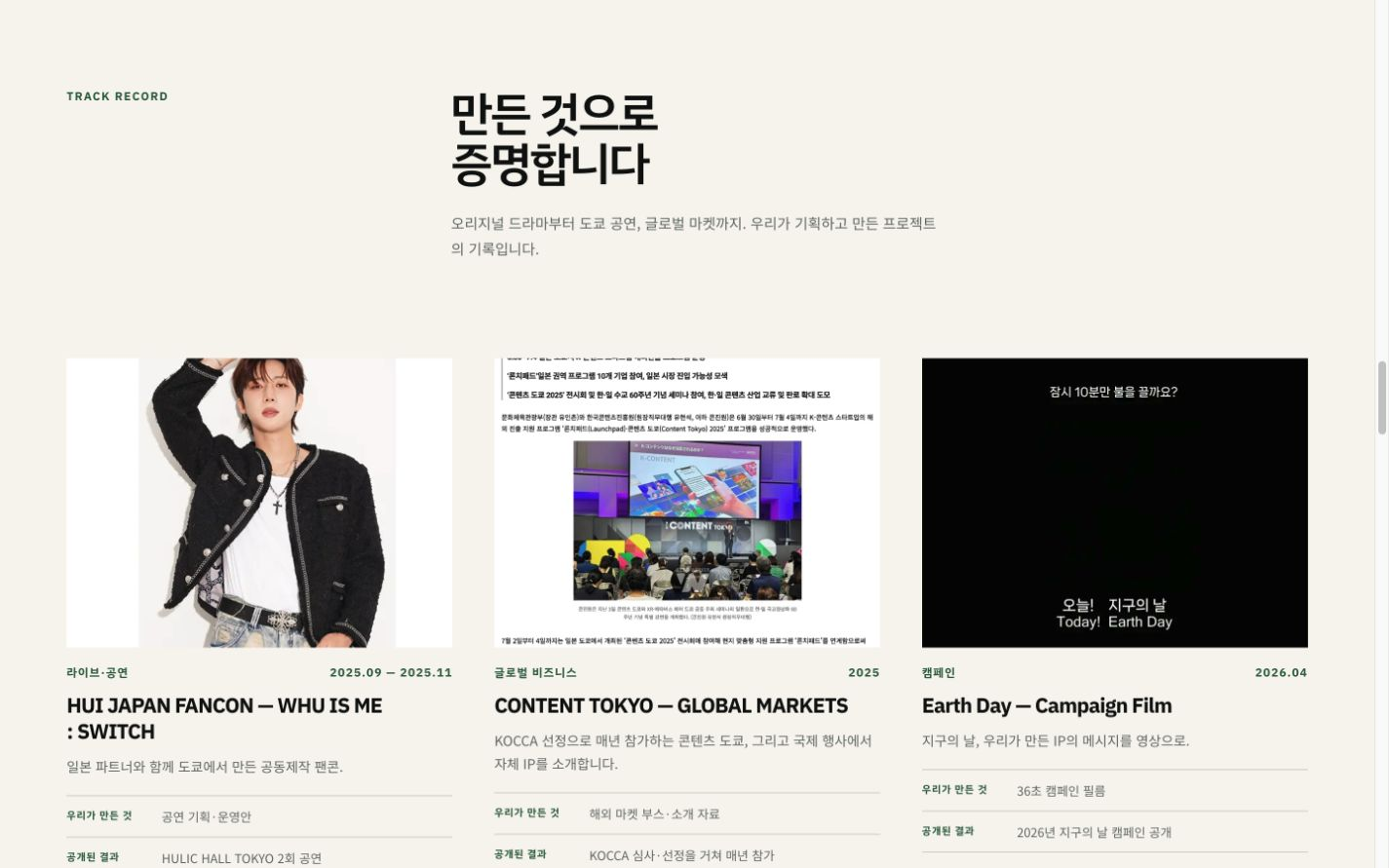
The August Preview moved through strengths, owned IP, company figures, Project Belian, project records, video, and News before contact. The live site edits that into a shorter homepage sequence of ABOUT, the IP lifecycle, Works, and News, with Company, WORKS, News, Careers, and Contact handled as separate pages.
The First Five Seconds Changed
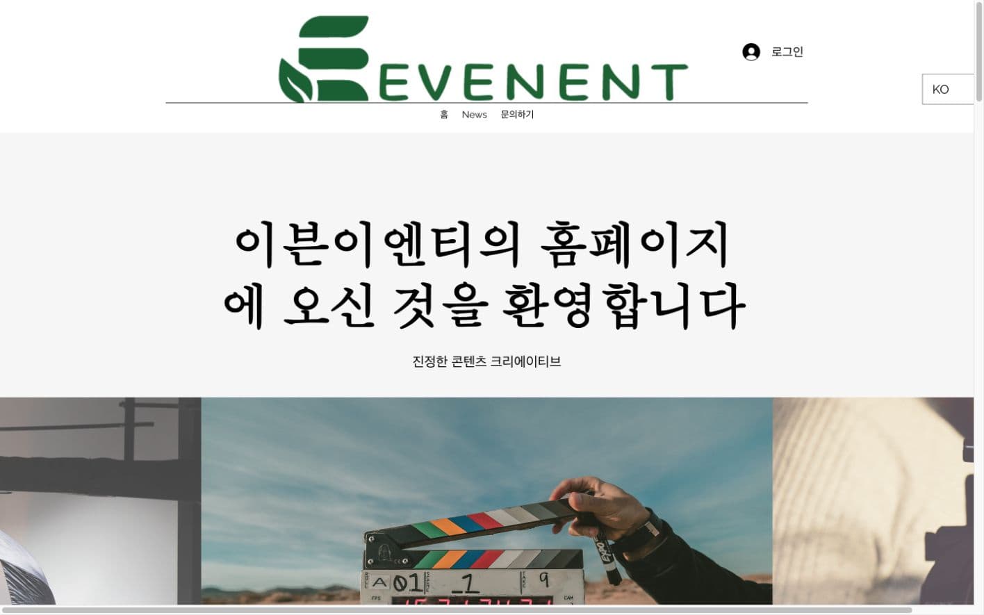
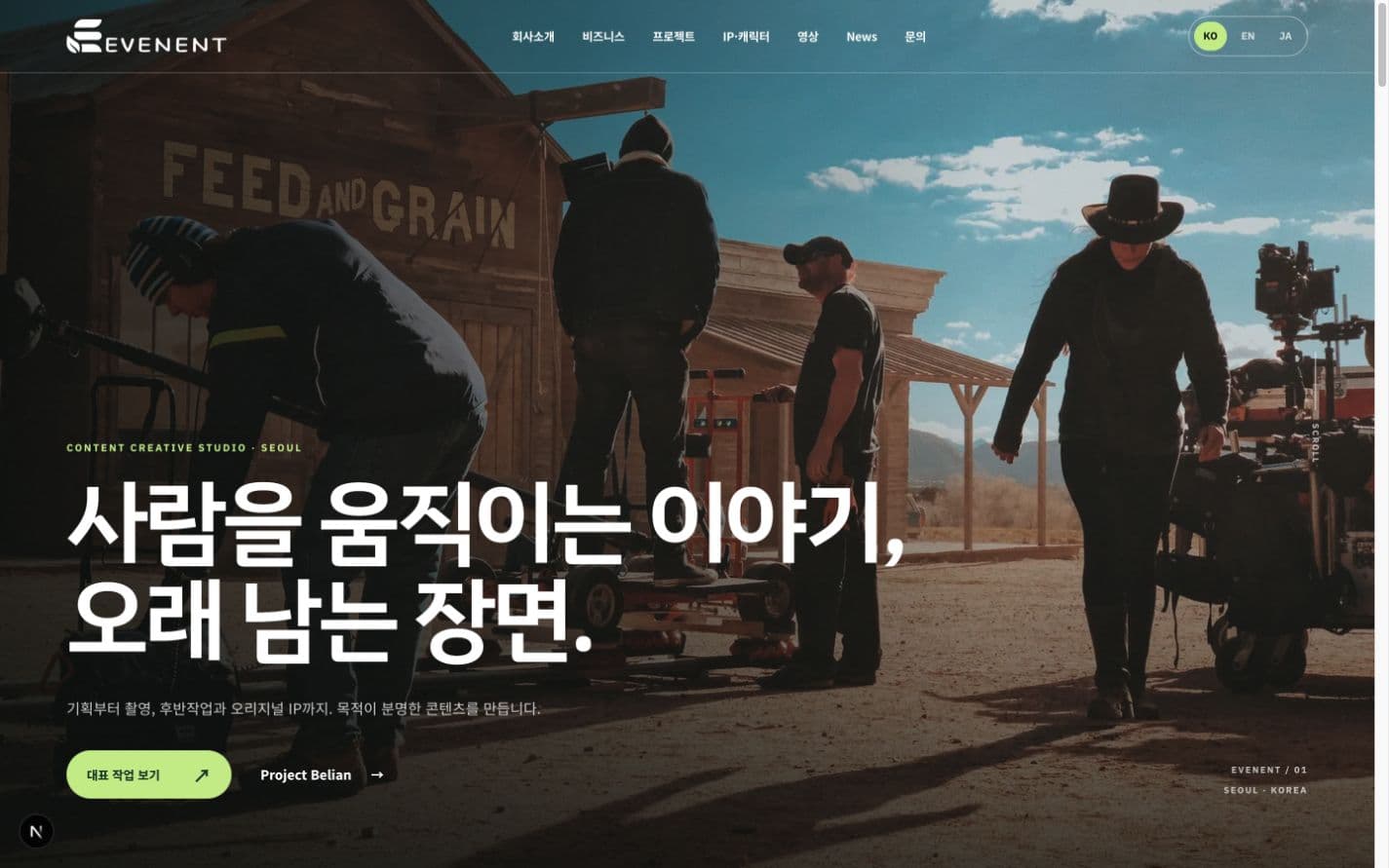
The original website and first redesign, both captured on August 2, 2026 with the same 1440×900 browser viewport.
The old headline welcomed people to the EVENENT website but did not explain what the company made. A changing set of production images still left a new visitor to decide whether EVENENT was a film crew, content distributor, or IP company.
The first redesign opened with a promise — stories that move people and scenes that stay — then named strategy, filming, post-production, and original IP. Selected Work and Project Belian gave the visitor two immediate next steps. The hero changed from a greeting into positioning and navigation.
We Removed the First-Visit Blocker
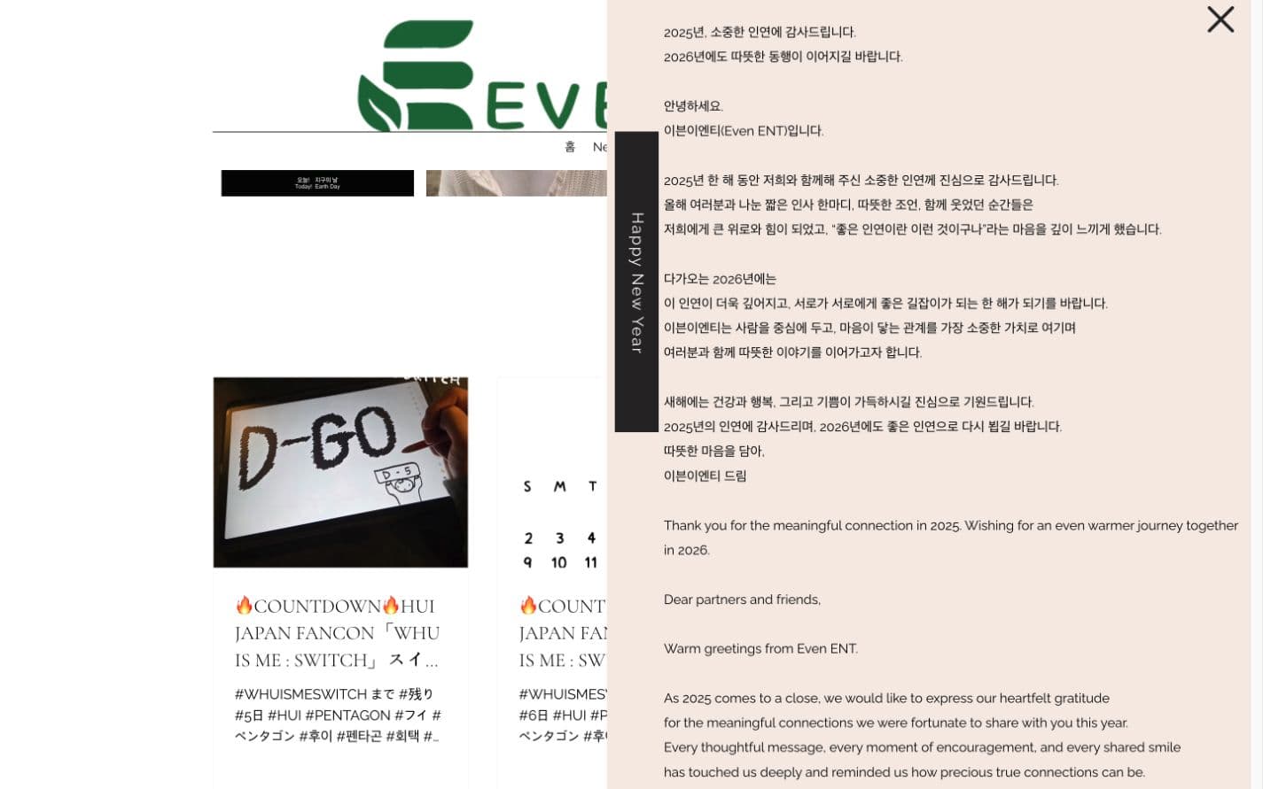
The live site still opened a long year-end message from 2025 in August 2026. On desktop it covered more than half of the page. The redesign removes the blocking popup: timely updates belong in News, while the homepage remains focused on understanding the company and its work.
The First Redesign Turned Services into a Production Process
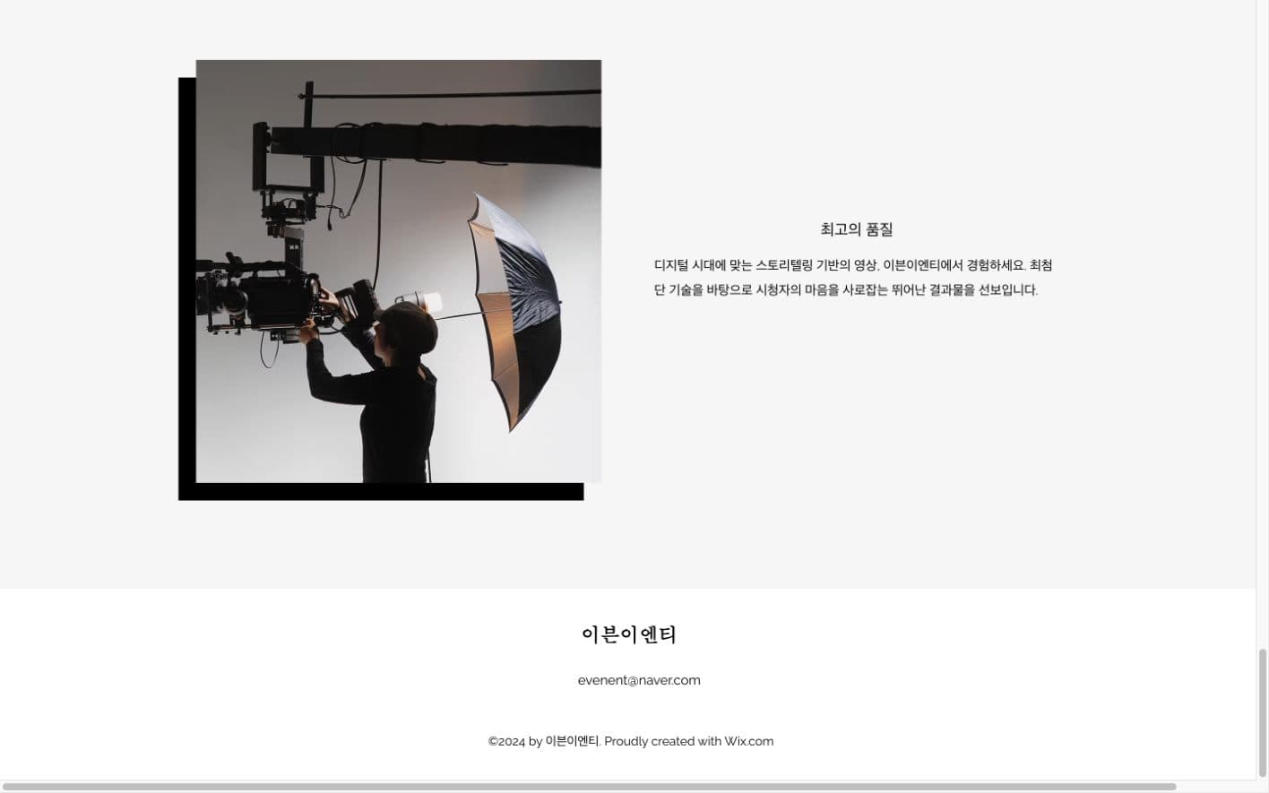
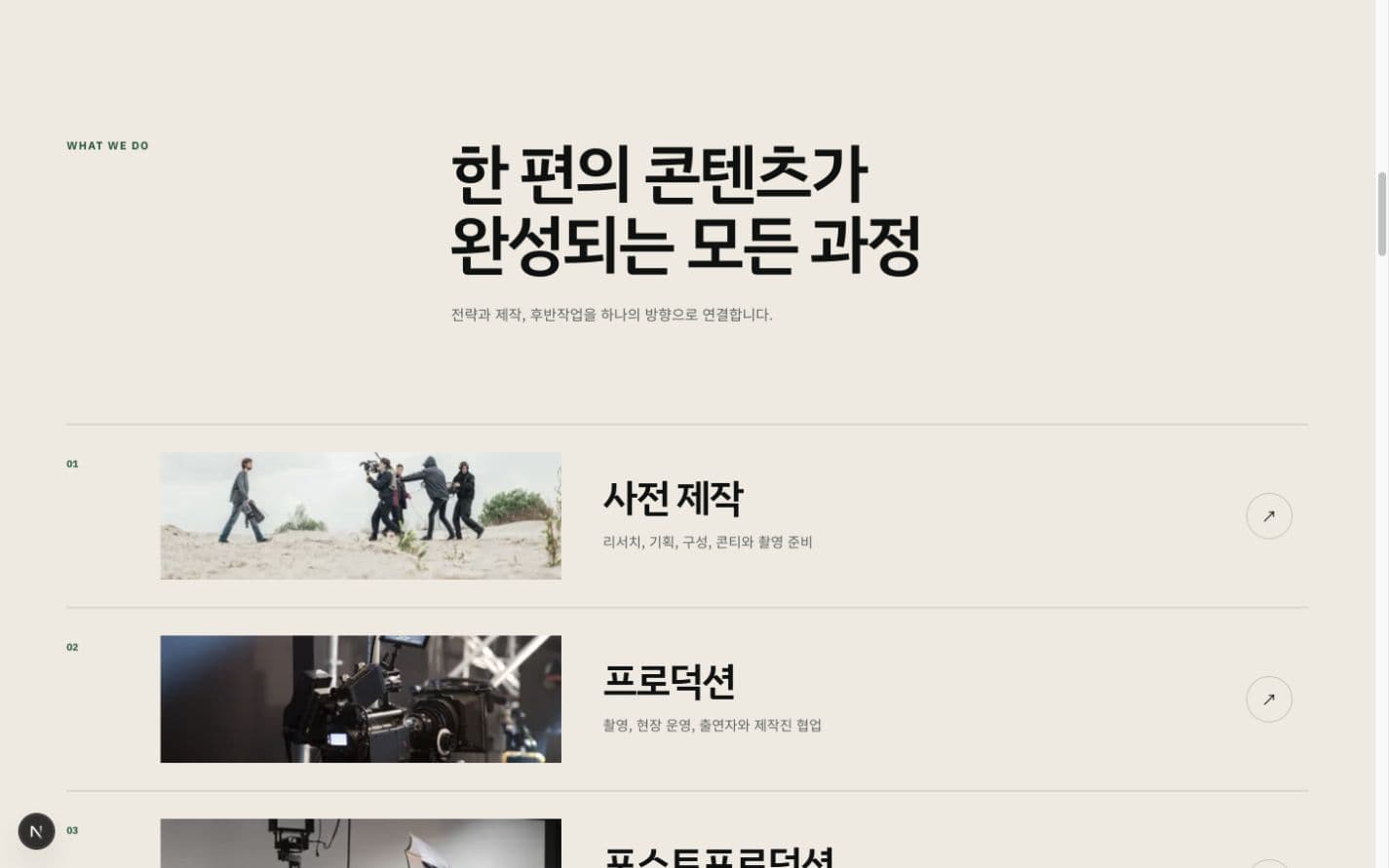
In the first redesign, an abstract quality claim became a process a potential client could understand and scope.
The old section used phrases such as ‘best quality’ and ‘cutting-edge technology,’ but it did not show what a client could commission. The first redesign separated pre-production, production, and post-production and linked each stage to business details. The August Preview regrouped the offer as IP planning, IP development, and production; the current production site expands it into the full sequence of planning, production, distribution, and IP expansion.
The First Redesign Turned a Content Feed into Project Proof
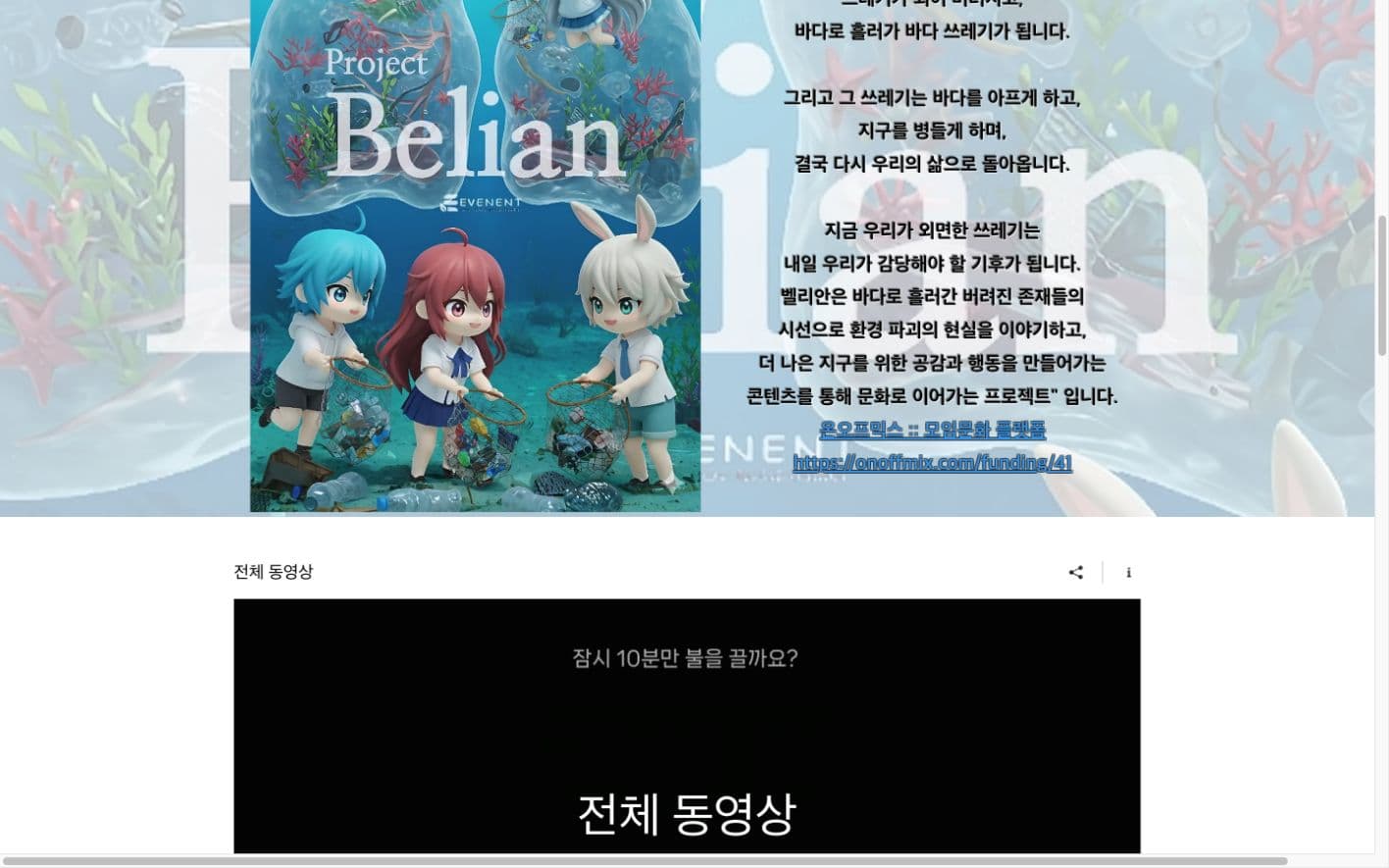
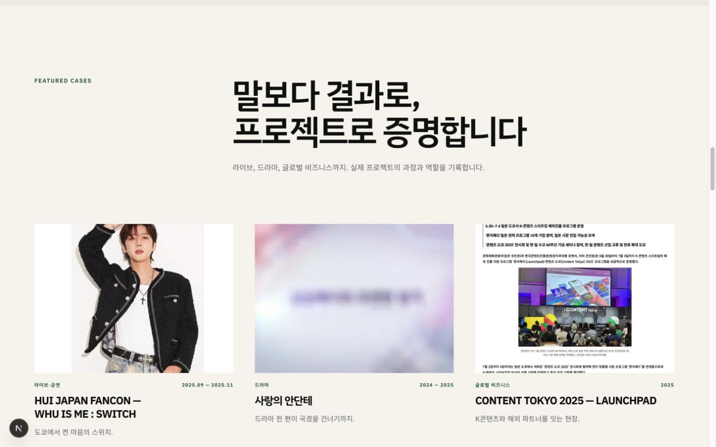
The redesign moves from listing owned content to proving completed work.
The old one-page flow placed Project Belian, an external funding URL, a Wix video widget, and long Japanese blog headlines one after another. The pieces existed, but visitors had to assemble the company's capabilities themselves.
The first redesign moved through positioning, capabilities, production stages, featured cases, original IP, selected videos, News, and contact. The August Preview moved three strengths and owned IP ahead of the project record. The current production site reorganizes that material as ABOUT, the IP lifecycle, Works, News, and task-specific detail pages.
Mobile Became Its Own Layout
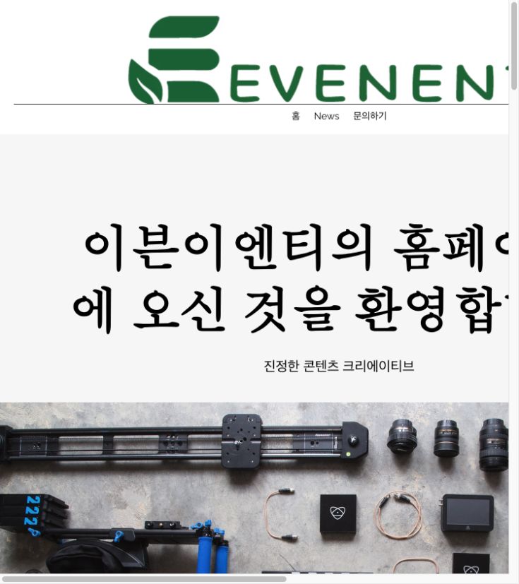
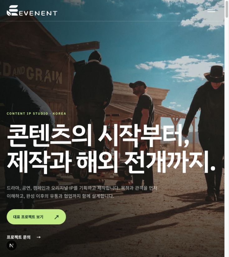
Both first-redesign screens were captured on August 2, 2026 with a 750×844 browser viewport. The resulting content area is the same 735×827 pixels.
The original mobile screen kept a fixed desktop width, clipping the logo, headline, and images and creating horizontal scroll. The redesign collapses navigation into a menu, resets headline size and line breaks, and keeps the primary action within the first screen. Understanding the company no longer depends on a desktop viewport.
What Changed in Planning
- A welcome message became a direct promise: We create content. We grow it into IP.
- Three generic links became Company, WORKS, News, Careers, Contact, and a language selector.
- A continuous content feed became ABOUT, the IP lifecycle, Works, and News.
- Generic quality claims became named works, content types, and dated public updates.
- A language menu lets visitors switch between the Korean and English sites.
What Improved Visually
- A large headline, short supporting copy, and the Works action form one clear hero group.
- ABOUT separates the company introduction into concise copy and open space.
- Planning, Production, Distribution, and IP Expansion are shown as four comparable stages.
- Image-led Works cards and a date-led News list distinguish content types and updates.
- Navigation, type, and cards reflow across the 1440×900 desktop and 390×844 mobile layouts.
The Final Change Was the Company Definition and Information Order
The largest change is not a color or photograph. The current homepage lets a visitor answer four questions in order: What kind of company is this? How does it grow content into IP? What has it made? What has it been doing recently? ABOUT, the IP lifecycle, Works, and News provide that sequence.
A redesign did not require discarding all existing material. Project Belian, Love's Andante, live and format work, project records, and updates were reclassified across several stages. The production site now presents them through a shorter homepage and purpose-specific detail pages.
What the project owner said
Real client feedback with its connection to this case and publication scope confirmed.
“We originally planned to hire zzzarit only for the simple task of distributing ads across social channels. They pointed out the more important issue first: no matter how widely we promoted the work, people would not become fans of our IP if the website was not good enough. We agreed and changed the contract from ad distribution alone to both website production and advertising. Looking back, that was a genuinely important decision.”
FAQ
Were the before and after screens captured under matching conditions?
Yes. The first comparison used a 1440×900 desktop viewport and a 750×844 mobile viewport. Both mobile screenshots have the same 735×827-pixel content area.
Is the redesign now live on evenent.com?
The September 2026 images show the website live on evenent.com as of September 20. The August Preview and AFTER 1 images show the intermediate design and first redesign respectively. Visitors can switch between Korean and English using the header language menu.
What was the first planning change?
The first version replaced the welcome message with a studio role. The August Preview put IP planning, development, and owned assets first. The production site now expresses that direction as ‘We create content. We grow it into IP’ and a Planning, Production, Distribution, and IP Expansion sequence.
Was all existing content replaced?
No. Project Belian, Love's Andante, live and format work, and existing updates were reused. Their classification, priority, explanation, and links to detail pages were redesigned.
What changed on mobile?
The first redesign removed the fixed-width overflow. In the September site, navigation, headline, supporting copy, and the Works action reflow to fit a 390×844 mobile screen.
Continue with a consultation or another website project
Start with your current website
We review the current URL first and separate full-redesign needs from focused improvements.
View details →CGDC 2025 official website
A conference website built around event context, speakers, the timetable, and registration.
View details →Event website development
Review the scope from public information pages to registration and operator tools.
View details →Get a quote from this setup
Zzzaritbot starts from what we delivered here and works out the scope with you.
View details →